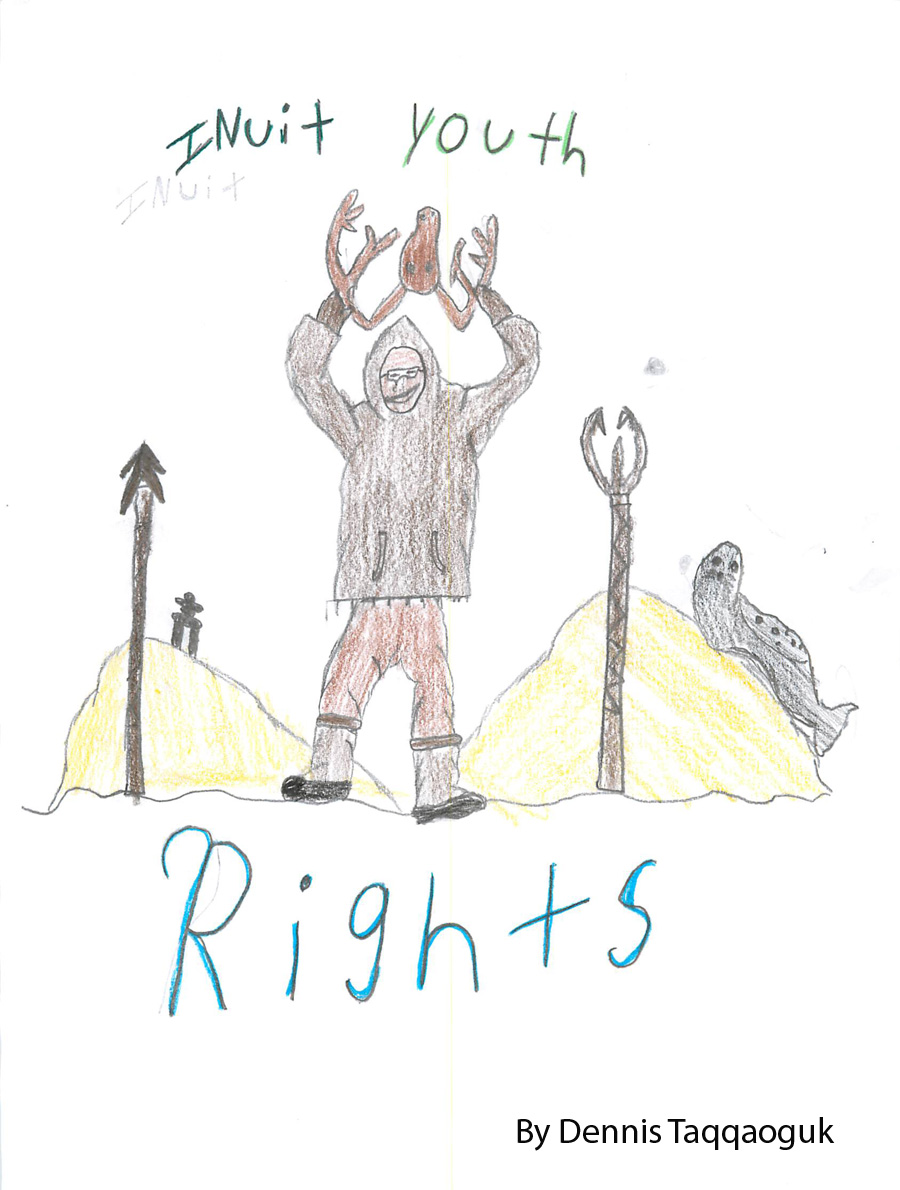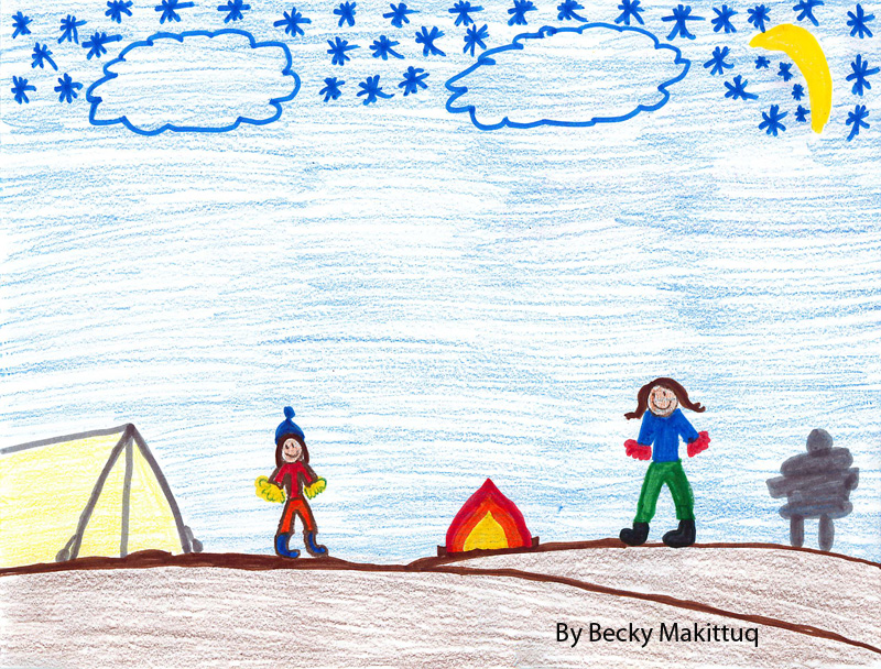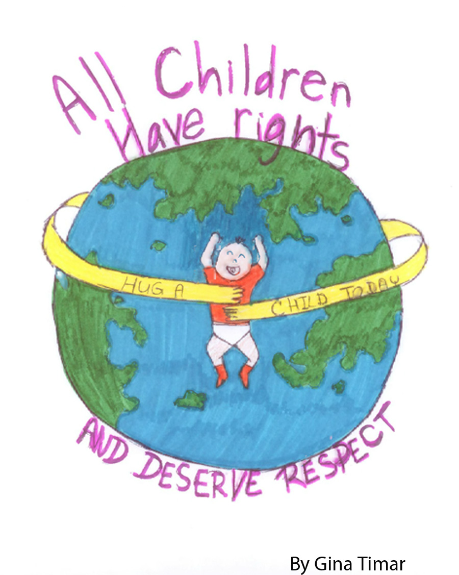
The story of our logo begins with Nunavut’s young people. We wanted our logo to be inspired by them – the people we support and work for. So we hosted a Nunavut-wide children’s art contest. We received many entries that shared ideas of empowerment, cultural connection and collaboration. Many of them showed the world from a child’s perspective. 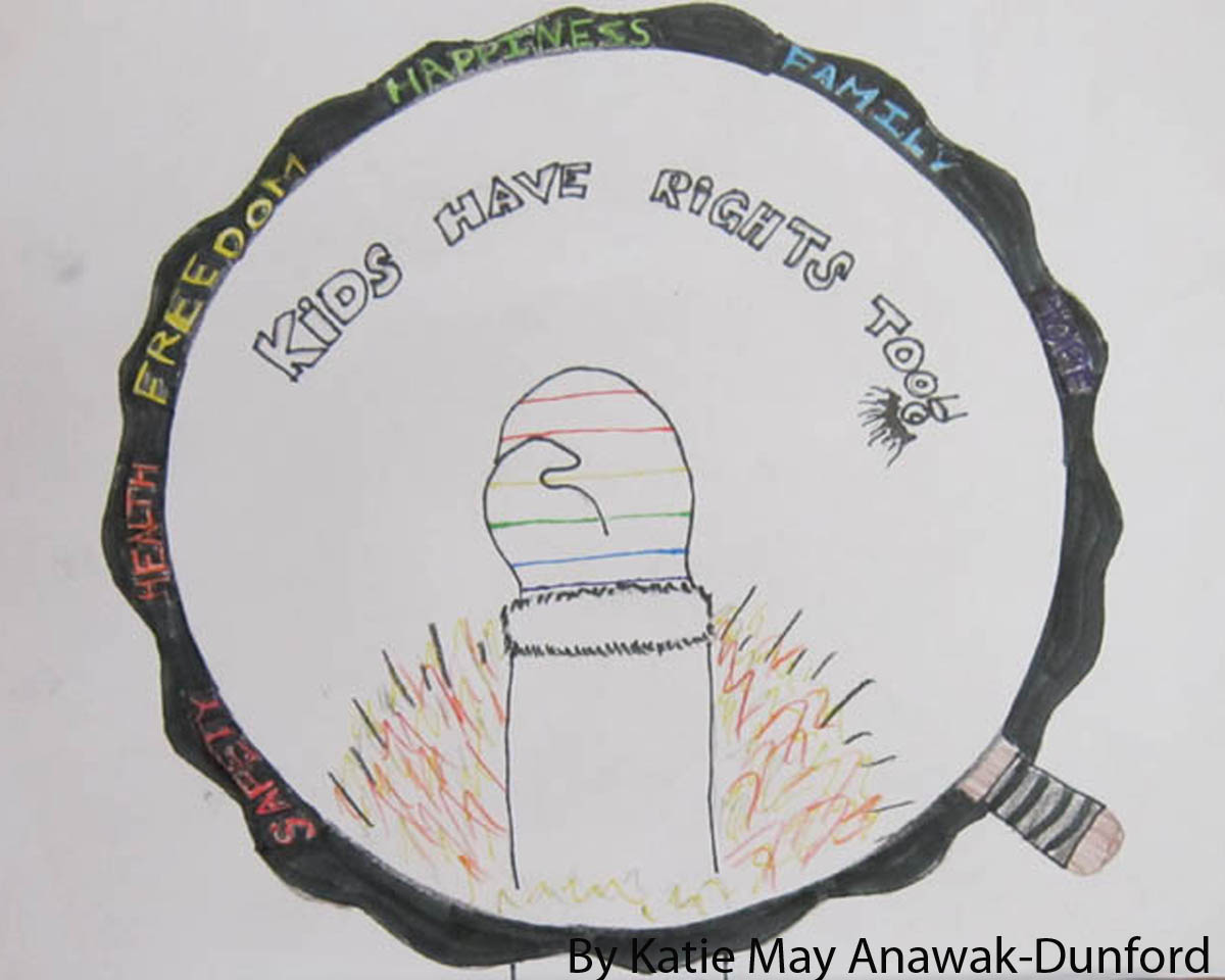
We then used these to inspire our logo design: a child and adult, holding hands, reaching up together towards four bright snowflakes. But what do all the elements in our logo represent?
Our logo shows a child and adult holding hands. The adult represents anyone offering support in the child’s life. It could be a parent, a relative, a teacher or someone from our office. Their gesture symbolizes support and working together.
Snow is also prominent in our logo. We’ve included it for a few reasons. It’s everywhere in Nunavut! It’s linked to the idea of playing. Snowflakes are also one-of-a kind, just like young people. We chose four snowflakes to represent the four guiding principles of the United Nations Convention on the Rights of the Child. If you count them, there are 54 points on the snowflakes in our logo. These represent the 54 articles, or clauses, in the Convention.
The parkas, Pangnirtung-style hats and kamiks show our connection to Inuit culture and values. They remind us of the vital role culture plays in a young person’s life. They represent passing on cultural traditions to younger generations. The logo colours are inspired by both Nunavut’s landscape and flag.
We want to sincerely thank young Nunavummiut for sharing their art and creative ideas with us. We are thrilled with their contributions and their role in the development of our logo!